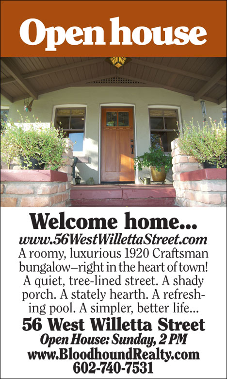
I wrote about the back side of that card last week. It’s the Open House invitation for 56 West Willetta Street in Downtown Phoenix, a home we listed for sale yesterday. This is a full-bore Bloodhound launch, but the card itself is kinda boring, wouldn’t you say?
That’s not an accident. I could wish I were more talented as a graphic designer, but I’m a firm believer that, if something is so cool looking that no one knows what it is, you’ve wasted your money. As radical as our real estate signs are, they still look like real estate signs. And the most profoundly valuable graphic element on our signs was suggested by marketing-provocateur Richard Riccelli: The snipe in the upper left hand corner that says “For sale.” In the uncivil war between obvious and obtuse, obtuse wins all the glamorous awards and obvious wins all the money.
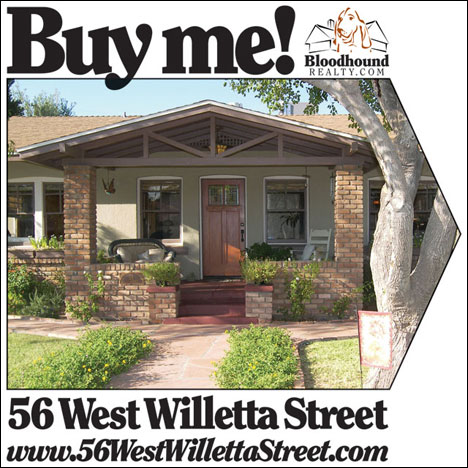
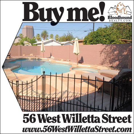
Which brings us to our directionals. I’ve been writing about custom directional signs for more than a year. In that time, we’ve gone through many designs, and we’ve never done the same thing twice. For this house, I think I’ve finally hit on something I like and will use again:


Could not possibly be more obvious, yes?
That “Buy me” call to action is swiped from Redfin.com. Their signs do nothing for me otherwise, but those two words are the essence of good copywriting, in my opinion.
In our own small way, we launch a house in the same we someone else might launch a new car or a new kind of dishwasher or a new magazine. Those business-card-sized Open House cards will be distributed to 6,000 homes. We’ll get a 1% or at most 2% response on that effort — extremely direct mail — but the chances are excellent that the ultimate buyer will be among the parties who come to the first open house.
And: The signs, the directionals, the web site, everything else we do to market our listings — these techniques sell houses. This is not rocket science. Drawing more attention — and more-positive attention — to a house will make it sell faster and for more money. In the market we live in right now, in Phoenix, only two types of homes are selling at all: The cheapest and the best. That implies the best-marketed, as well, and that much seems obvious to me, too.
If you bring yourself to BloodhoundBlog Unchained in Orlando, I’ll talk to you about what we’re doing, how we go about doing it, and why it works.
Click on the PayPal button shown below to get your discount price – $99 for BloodhoundBlog Unchained in Orlando on Friday, November 7th, 2008
When: Friday, November 7th, 2008, 8 am to 8 pm
Where: Crowne Plaza Hotel and Conference Center, Orlando Airport, 5555 Hazeltine National Dr, Orlando, FL 32812
Listing our way is a lot more work, to be sure. But unlike the Realtors we compete against, our listings sell. And if the benefit of that is not obvious, you might just be a candidate for an award…
Technorati Tags: BloodhoundBlog Unchained, real estate, real estate marketing, real estate training, technology

Gig Harbor Real Estate says:
The old copywriting “AIDA” applies here, attention, interest, details, action. The photo supplies much of the interest and details, and the simple “Buy Me” is a classic call to action. Great work!
October 11, 2008 — 10:41 am
Curtis Reddehase says:
The angle of the first picture made the home look very inviting and bright, and not having anything else stricks curiosity.
October 11, 2008 — 1:18 pm
Orlando Refinance says:
I am looking forward to meeting everyone at the Orlando event. expect to learn a lot!
Chris
October 11, 2008 — 1:39 pm
Cheryl Johnson says:
Are you doing these in aluminum or coroplast or something else? Do you only put them up during an open house?
October 11, 2008 — 5:35 pm
Greg Swann says:
> Are you doing these in aluminum or coroplast or something else?
The big signs are done on aluminum. The directionals (18×18″) are done on coroplast mounted on wire H-frames.
> Do you only put them up during an open house?
No, we buy enough of them to drive traffic to the home from the key turns, then we wheedle the neighbors into letting us mount them in their lawns. We use regular directionals, as well, for Open Houses.
October 11, 2008 — 6:40 pm
Miami Beach Attorney says:
Those are great signs–I especially like how they promote the sale, not the Realty company or the name of the listing agent.
October 12, 2008 — 7:03 pm
Greg Swann says:
> I especially like how they promote the sale, not the Realty company or the name of the listing agent.
Thanks. We have to identify the brokerage by law, but I don’t see any point in wasting a lot of space on it. Wherever we list, people figure out who we are right away.
October 12, 2008 — 7:24 pm
Robert Kerr says:
FYI, maybe it’s just me, but I do *not* like “Buy me” in any for sale advertisement. Anyway, just my 2c.
October 12, 2008 — 8:00 pm
SM says:
I like the “Buy Me” line. I feel like it makes it more personalized inviting then a “For Sale”. These days you need something that differentiates your listing from others, and this does the trick while being very inviting and well done.
Sean Murphy, Rofo – Oakland Office Space
October 13, 2008 — 9:44 am
J Boyer Summit NJ says:
I totally agree with you Greg. A REALTOR does not have to be overly fancy with such marketing pieces. They just need to look professionally done, and basically club the reader over the head with what you want them to do.
October 13, 2008 — 10:08 am
Jennifer says:
Greg, I have read your Strategic Marketing Plan and in it you mention having an open house every week until the home sells. Is that why on this Open House buisiness card you have, Open House:Sunday 2:00pm? I’ve noticed the day and time is given, but not a date. Is that because you will be having an open house every Sunday at 2:00pm?
October 30, 2008 — 11:27 am
Greg Swann says:
> Is that because you will be having an open house every Sunday at 2:00pm?
That’s exactly right. This is how we do open houses.
October 30, 2008 — 11:35 am