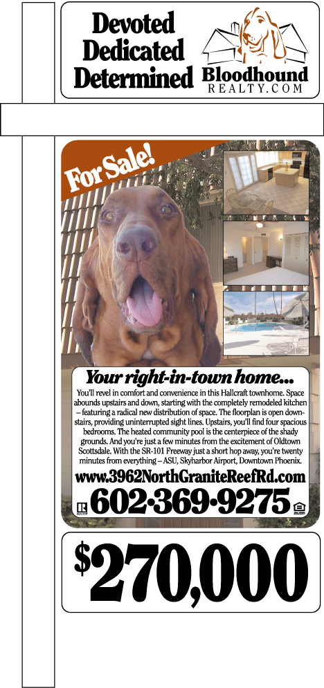
Okay, now we have the full treatment, a big sign at 24×36″ plus the two smaller signs. The two custom signs were made at one-sixth scale in QuarkXPress, then scaled up in Illustrator, then rasterized at 300 DPI in PhotoShop. I want to do it differently the next time, because I think I’m losing too much saturation in these steps. I think if I save the photos as PhotoShop CMYK EPS files, then scale and rasterize in the same pass when I come back to PhotoShop, I can retain all the color from the original photos. The finished raster for the big sign is 449 megabytes. These had to move on CD-ROM by sneakernet. It would have been too slow to FTP them — and I have a 3MBS broadband connection. Turnaround at the sign printer: 28 hours. Color is spot-on, so if I get it right on my end, I’ll have it right on theirs.
The ‘For Sale!’ snipe is Richard Riccelli, who argues that you can’t be too clear about your objectives. I think the headline and body copy are too small. (You’re seeing this at about 21.67% scale.) I can stretch the headline, but I’ll have to cut the word count on the body copy. You have to be able to read it when you’re sitting in your car near the sign, and I think I’m just a little too small for that right now.
But: It does what I want it to do: It stops traffic. I sat up the street and watched people. Most slow down to check it out, and many stop to read it and pull the flyer. This is good for our seller and good for us.
Technorati Tags: arizona, arizona real estate, phoenix, phoenix real estate, real estate, real estate marketing

Nathan Hughes says:
My gut reaction was to be concerned with the amount of information on the sign and how readable it would be.
The concern with having too much info is only real if the target customers are not able or willing to take in the information. But, if people are stopping to read it, then that demonstrates how effective the sign is.
Congrats on a successful field test!
August 19, 2006 — 11:28 am
Greg Swann says:
Thanks. Follow this link to our underlying sign philosophy. Another advantage we pick up by working this way: We can try different things with each sign. In a year, we’ll know what works and what doesn’t — for the first time in the history of real estate signs!
August 19, 2006 — 12:16 pm
Nathan Hughes says:
Nice. I like it. That’s what the industry needs, more well-thought out alternatives to the traditional approach.
August 19, 2006 — 1:07 pm
Greg Swann says:
Bingo! We may not always be right, but we have good maps to lead us into and out of error. A year from now, I want for us to be the last word on residential real estate marketing in Phoenix. Not the biggest — there are only two of us so far — just the best.
August 19, 2006 — 1:16 pm
Richard Riccelli says:
I should be careful with my free advice … is it just me, but does the FOR SALE snipe have the unfortunate effect of making it look like Odysseus is what’s being offered? A bargain I’m sure at $270,000…
August 19, 2006 — 2:26 pm
Greg Swann says:
I want to test the middle sign without the dog. I want more house, and the house is behind the dog. It’s a trade-off, because we know the dog pulls eyes, but I think the house could, too. In any case, I’m out there as a correspondence course student from the Riccelli School of Market Research, spying on the passersby from two blocks away. I end up making calls and doing paperwork from the car so I can see what’s happening with the signs. The gross idea works. We’ll need a lot more granularity to judge the particulars, and I may yet end up with a frolicking clipboard, so I can compare apples to apples.
August 19, 2006 — 2:36 pm