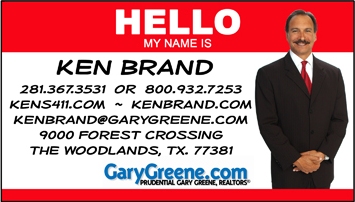
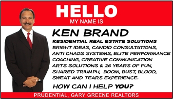
I’m a big fan of Scott Ginsberg the “Name Tag Guy”, I thought the name tag idea would make my card seem casual and approachable…wanted a short little resume so I put it on the back of the card. No sense wasting the space.
I’m looking forward to seeing what others are up too…thanks.


It’s time for you to show us what you’ve got.
Technorati Tags: real estate, real estate marketing
Eric says:
Every little bit helps..
I remember as a young fledgling agent years ago, I used to stare enamored by the outlay of cards at our RE/MAX. With over a hundred agents, there were all sorts of templates to use for ideas.
However, KISS always applies.. I think this would at least get some conversation going, even if only a giggle and a joke. And any reaction is one that can be worked with by a true salesman.
August 24, 2007 — 11:58 am
Derek Burress says:
Greg: Did you get my email about your directional signs and having business cards shaped in odd shapes?
I feel like people will keep these unusual looking business cards longer than the standard rectangular ones. I know I have never seen a business card shaped like a directional sign, so it’s something I would keep longer than normal to show off. Kind of like a those religious tracs that are in the form of one million dollar bills. No one has ever seen a million dollar bill, so they then to get kept a bit longer than they would say if the tracs were of simple one dollar bills.
August 24, 2007 — 2:38 pm
Michael Price says:
Ken Brand is the kind of leader that sees a concept and “gets it” so fast it’s almost scary. I have to say when I first saw this approach I wasn’t so sure. At first blush it seemed kind of cheesy and not like Ken at all to me. It wasn’t until I talked to him and read his blog posts on the issue that it all started to sink in. I was so intrigued with the book that inspired these cards (The Name Tag Guy) I did a blog interview with the young author, Scott Ginsberg. Very interesting stuff indeed.
August 24, 2007 — 4:20 pm
Dave Barnes says:
Ugly cards. Red is way too hot. Fonts are cheap looking.
Sleazy.
As a consumer, I would not do business with this Realtor(R) in a million years.
August 24, 2007 — 7:53 pm
Dave Barnes says:
P.S.
Wear a suit and tie and you don’t get my business.
Golf shirt with a logo (Ken Brand and not GaryGreene).
I am very confused by the Ken Brand and Gary Greene.
Are the same person?
Cousins? Brothers?
Talk about weakening your brand identity.
August 24, 2007 — 7:57 pm
ken says:
Dave, my man…you’d be missing out. What if I was the last Realtor(R) on the planet?
Seriously, I appreciate the candid feedback.
All communication is work in progress..it’s art not science…no?
Today’s bright idea is tomorrow’s dim bulb. Of course I chose red because it is hot. The font is “heriod”…a super hero kinda deal. Funky indeed…I thought thrice before I pulled that trigger…bang, bang..not sure who got shot.
Not your cup of tea…I get that. Does it make people giggle…yep. Does it stand out…yep. Is it a conversation piece…yep. Does it repel…sure…does it attract yes. Some days I question my own judgment, some days I slap myself on the back. One thing for sure…people don’t generally yawn…it evokes emotion of some sort…amen.
Is it a purple cow…or maybe a red herring?
Forget the picture…what do you think of the copy? How’s that sound, look and feel?
Everyone want’s to been seen as normal, nobody wants to be seen as average. What?
I toss it out there…stir it up, see what happens, who barks, who bites, who meows, who purrs.
I’ve learned that if you want to be all things to all people…bad news, you’ll be nothing to everyone.
I’ve been in the business for 27 years…I’ve had dozens of cards…some cool, some crap…I’ll keep morphing. One thing for sure, you’ve got to reinvent yourself, always and forever.
Not sure what I’ll do with the next one…but there will be a next one, and a next one and a next one.
All the feedback is appreciated. Love to see some example for inspiration.
Thanks….kb:-)
August 24, 2007 — 8:25 pm
Dave Barnes says:
@Ken
1. One phone number. Don’t confuse me with two. I prefer the 281 one because it is local.
2. One website: KenBrand.com and you do the capital KB so it is easier to read. No kens411.com as I don’t see the point when it points to the same place. KenBrand is the brand and no pun intended.
3. Email of Ken@KenBrand.com and not GaryGreene.com. I can not figure out why you are promoting Gary when you will ditch him next week.
4. No period on the TX. Read the USPS rules about standards.
5. You selected a font that a child would use. At least you did not use MS Comic Sans. Use a professional adult font. Myriad Pro for example.
6.”What if I was the last Realtor(R) on the planet?” I still would not use you as I live in Denver and we don’t cotton to Texans.
7. What are “anti chaos systems”? Proper gammar would be anti-chaos. Meaningless phrase.
August 24, 2007 — 11:16 pm
ken says:
Mornin Dave,
1. We deal with lots of relo clients moving from other states…even Colorado. When calling from work or home, they appreciate the 800 number.
2. I’m building a new Kenbrand.com site, it’s pointing to 411 temporarily. You’re right, it would be silly to point both to the same spot.
3. I hear you…never really thought about it that much. I have been here with Gary Greene for 11 years.
4. Good point…hope I don’t get arrested.
5. A matter of taste.
6. I grew in Cali., lived in Colorado for a while, does that count for anything?
All in all…pretty fine analysis Dave…thanks.
kb
August 25, 2007 — 4:56 am
Phil Hoover says:
Other than the psychological reasoning of making it easy for someone to call by offering a 800 number, it is silly.
LD costs about 5 cents/minute now and most people have free LD on their cell phones.
I would rather capture the people who don’t think about “free” and NOT have an 800 number.
August 25, 2007 — 8:13 am
BR says:
Ken, jmho here. You can’t be all things, but you could be more to more than just a few…
I think it’s an okay card, but on the top card, reduce the size of the address.
Bullet point with font size or shadding.
Repeat on the second card. There are several things being said there- better in bullets than a large group. Bullet points are old school, how about tagcloud style?
The cool thing about your card is the convention nametag style of the HELLO My Name is- that’s funny- so long as your next phrase isn’t “and I’m an alcoholic” you’re all good! Thanks for sharing.
August 25, 2007 — 8:30 am
ken says:
Thanks all…interesting and thoughtful comments.
I appreciate the feedback.
ken
August 25, 2007 — 12:02 pm
Chuchundra says:
Wow, a lot of harshing on Ken, here.
I like the basic design and idea of the card. The “Hi, My name is” bit is cute and, as much as I don’t like cards with photos, your full body shot works a lot better than a lot of those extreme, tight closeups of people’s mug.
Where I’d criticize you is the “Residential Real Estate Solutions” and all the text under it. What does all that mean? To me it means nothing. It’s just a big lump of corporate speak.
To me, your card design says friendly, outgoing and no BS. Why much that up with talk about “solutions”. Who needs a real estate “solution”? Reading your card, I’m not even sure what you do. Do you sell houses, mortgages or office furniture ?
August 25, 2007 — 6:39 pm
Dave Barnes says:
Ken,
Consider having one side use red and the other blue.
The red and blue of the [Texas] state flag are: (1) the same colors used in the United States flag; and (2) defined as numbers 193 (red) and 281 (dark blue) of the Pantone Matching System.
August 26, 2007 — 10:04 am
Knoxville Real Estate Guy says:
I like the “Hello” card for real estate agents (or most other professions), but I agree with the earlier comment – it’s a bit ugly and loud.
August 26, 2007 — 1:16 pm