Richard Riccelli is a direct marketing creative genius. Where better to express that genius than on his business card?
Says Richard:
A website preview and a free offer all on a business card…
Each card features a common contact front with a different info back that makes a free offer — while visually previewing my website.

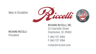
Common front of the cards.

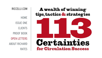
One back.

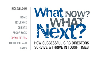
And another.
What better way to sell the product than with small, unobtrusive but very potent demonstrations?
What about you? Show us your business card and the thinking behind it.
Technorati Tags: real estate, real estate marketing
Teri Lussier says:
I love this! I’ve been thinking along these lines myself, but not sure about the how and what.
I’d love to move away from traditional RE postcards and flyers and really push business cards as a primary advertising tool. It just makes sense. Business cards are inexpensive to print, but more importantly everyone loves a great business card. A well done business card gets taken out and passed around during casual conversation. Postcards and flyers…Eh, not so much.
Plus a well done business card is kind of forever. People hang on to them regardless of what is being advertised on it. Portable, tactile, visual, unobtrusive- perfect advertising medium. Realtors don’t use them to full advantage.
Having said all that, the key here is “well done”. An awful business card is kinda sorta like a used tissue- you can’t wait to get rid of it, and no one else wants to see it lying around either.
August 23, 2007 — 5:25 am