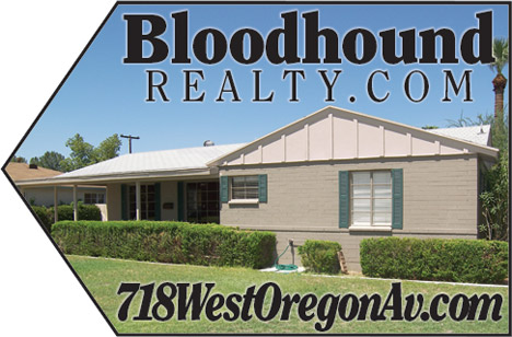
I wrote about this before, but I don’t think I have what I want even yet. These will print 18″x12″, but I may go to 24″x18″ the next time. My design skills are not the best, but I arrived that this because I wanted three things on the sign, and this seemed like the best way to get them. I wanted the name of the brokerage, the web address for the house, and the maximum amount of photo I could get. This is what I ended up with for a first attempt:


Technorati Tags: real estate, real estate marketing, real estate photography
J. Ferris says:
What happened to the four pics you had originally created for directional signs?
August 21, 2007 — 8:47 pm
Greg Swann says:
I killed that idea. I liked the visual variety, but I couldn’t see anyone resolving the images from a distance.
Here’s an idea I’ve been playing with, and it would pay off well here:
Photo shoots for houses. Hired models enacting benefits, just like real advertising. In this shot, a dad and kid playing catch or a kid playing with a big yellow Labrador would work very well.
August 21, 2007 — 8:55 pm
J. Ferris says:
A great idea but I think it’d be cost prohibitive on a per listing basis. Could you take advantage of that idea while utilizing the cost effectiveness of istockphoto.com?
A few examples:
Example #1
Example #2 (this one really works for your idea)
August 21, 2007 — 9:01 pm
Greg Swann says:
> A great idea but I think it’d be cost prohibitive on a per listing basis.
This house will list for $300,000, low for us and for North Central Phoenix. There’s room in the budget, especially for thrills that kill.
I was talking to my kid tonight about why Odysseus, the trickster, matters so much in Western Lit. We don’t have to fight fair. We just have to beat Polyphemus every freakin’ day.
I know now what I want in these signs. Not a black border against a white background, but a full-bleed with the stock trimmed to the arrow shape. That would totally rock, but I’ll have to wheedle a vendor to get them to think outside the rectangle.
August 21, 2007 — 9:13 pm
Roberta Murphy says:
Greg: Let the signmakers think inside a box, because all you need to do is trim the sign by hand.
August 21, 2007 — 9:24 pm
J. Ferris says:
Beazer Homes uses a similar system of signs as does K. Hovnanian leading into their communities. To put this into frequent use I think I’d like to see a more streamlined design. Is it possible to incorporate an arrow within the design and shape above?
August 21, 2007 — 9:27 pm
BR says:
Greg, that is awesome. When I tried to do this, I didn’t realize that I didn’t have to actually have an arrrow shaped sign. The cost for a shape sign is high dollar- thanks for putting up the example.
August 21, 2007 — 9:41 pm
Russell Shaw says:
Nice, sir. Really nice.
August 21, 2007 — 10:19 pm
Dave Barnes says:
1. I would abbreviate Avenue as Ave and not Av
2. I would use Helvetica or Arial with tracking set to +10 for the URL.
3. I would not use italics for the URL as they are more difficult to decipher.
August 22, 2007 — 3:09 am
DW says:
You could try a program called rasterbater (sounds kinky but it works) It breaks an Image up and tiles it to as few or as many pages as you wish. You print the tiles and then tape or glue them together for a complete object. You are pretty much limited by your ink supply. There are some examples on the site that have 6000+ pages printed to make one image.
August 22, 2007 — 6:50 pm