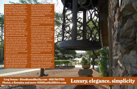
A week from today, we will list our first million-dollar residence. (The web site is a placeholder as I write this. We’ll begin to populate it next week.)
But the home is a spectacular specimen, and we wanted to do something more to bring that out. So yesterday we put together our first full-color brochure for a home.
That’s the outside face. Full-size is 17×11″, with a fold in the middle to permit it to fit into our flyer boxes. You’ll have to imagine where the fold will split the image.
And here is the inside face. If you click on either image, you can see the full-size, full-bleed pre-press files. Fair warning: They’re 87 megabytes each.
Here’s the text from the inside front panel:
True luxury, true elegance is not a
vast accumulation of shiny trinkets,
a mass of dazzling distractions.
The artifacts of genuine wealth are
streamlined, refined, stripped down
to the essence. Simple. Unaffected.
The best expression of your limit-
less lifestyle is a home that serves
as the jewelry box for the precious
treasure that is your family…
And that’s why god made Lord & Taylor…
This is going to be a fun one for us, a chance to put every idea we’ve been playing with to the test.


Betty Luce says:
Congratulations on the listing. You may want to identify a lender who has a good jumbo loan package so you are ready to provide a resource for potential buyers and their brokers. It’s my experience that sometimes we need to do both sides, whether or not we are paid for it! Looks like a wonderful house! Let us know when the website is up.
October 9, 2009 — 12:43 pm
Steve Holben says:
Million $ homes are targets for critics. Make sure that someone totally familiar with the home and its features it present at every showing, and takes the time to point out all of the special features. I’v built these types of homes for years, and am totally and completely shocked, baffled and irritated that VERY few brokers are even the least bit knowledgable about what they’re showing or have any interest in learning before they show it. I’d be so adament about this that if a broker doesn’t want you there, don’t let them show it. They’ll just track on the carpet. A good broker wanting to make $$ will be thrilled to have you there. Believe me on this. Uncle Stevie has almost 40 years of experience.
October 9, 2009 — 1:39 pm
Robert Worthington says:
Greg, beautiful home and the flyers are awesome. When you sell your listing, no more drought!!!
October 9, 2009 — 4:01 pm
Mark Green says:
Congrats all around Greg. Thanks for sharing.
October 9, 2009 — 4:57 pm
Russell Shaw says:
Beautiful home. Stunning flyer. Nice job, sir.
October 9, 2009 — 5:59 pm
Greg Swann says:
> Beautiful home. Stunning flyer. Nice job, sir.
Bless you. Thank you. I was at your short sale site yesterday. Very comprehensive information, a big time-saver for buyer’s agents.
October 9, 2009 — 7:29 pm
Jody Cowdrey says:
Killer flyer, Greg.
Care to share where you have these printed up? In the past we’ve use Growll (for larger runs), and QuantumDigital (for short runs), as they were each cost effective. We couldn’t get anything run locally that compared.
October 11, 2009 — 5:42 pm
Greg Swann says:
That piece is being printed at PSPrint. I don’t love their prices, but they’re pretty aggressive on turnaround. My plan was to try Rush Printing Services, but their dipshit FTP server wouldn’t let me upload more than 100MB. Ideally, I want to move files like those as PDFs, so with a lot of hi-rez photos, the files can get big. Big deal. Disk space is cheap, as is bandwidth. I don’t like vendors who cheap out the small stuff.
Thanks for the references. I’ll look into them. We need more and more stuff, and turnaround is everything for us.
October 11, 2009 — 5:53 pm
Jody Cowdrey says:
We used Quantum early on because we could order anything by like 2pm (if I remember correctly) and get it the next day via FedEx. Insane turnaround times …and they were the only place we could do short run. It’s been a while, though…not sure if they still do that.
October 11, 2009 — 6:22 pm
Teri Lussier says:
Oh how gorgeous! Congratulations!
Maybe my eyes are old, one suggestion? The photos are beautiful, but I’m having trouble finding visual resting places on the inside of the flyer. There’s a nice flow from the cooktop to the “Cucina” sign, and then clockwise around the flyer, but I’m looking for someplace to stop and really study the space. The color palette and dark and lights keep the eyes moving.
October 12, 2009 — 5:11 pm
Greg Swann says:
> but I’m looking for someplace to stop and really study the space.
Make a showing appointment. There’s room for your whole brood. 😉
Remind me to send you a hard copy so you can see if you’re having the same problem with the printed piece.
October 12, 2009 — 6:38 pm
Nick says:
Nice,
hope you move it.
It maybe to me one day!
October 13, 2009 — 8:39 am